
 by
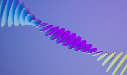
by How to make an animated moving CSS gradient background using only CSS with, no javascript.
<html>
  <head>
    <title>CSS Gradient Background</title>
    <style>
      body {
        width: 100vw;
        height: 100vh;
        background: linear-gradient(
          190deg,
          hsl(170deg, 80%, 70%),
          hsl(190deg, 80%, 70%),
          hsl(250deg, 80%, 70%),
          hsl(320deg, 80%, 70%)
        );
        background-size: 200% 200%;
        animation: gradient-move 30s ease alternate infinite;
   box-sizing: border-box;
        margin: 0;
        padding: 0;
      }

      @keyframes gradient-move {
        0% {
          background-position: 0% 0%;
        }
        100% {
          background-position: 100% 100%;
        }
      }
    </style>
  </head>
  <body>
</body>
</html>
<html>
<head>
<title>CSS Gradient Background</title>
<style>
body {
width: 100vw;
height: 100vh;
background: linear-gradient(
190deg,
hsl(170deg, 80%, 70%),
hsl(190deg, 80%, 70%),
hsl(250deg, 80%, 70%),
hsl(320deg, 80%, 70%)
);
background-size: 200% 200%;
animation: gradient-move 30s ease alternate infinite;
box-sizing: border-box;
margin: 0;
padding: 0;
}
@keyframes gradient-move {
0% {
background-position: 0% 0%;
}
100% {
background-position: 100% 100%;
}
}
</style>
</head>
<body>
</body>
</html>