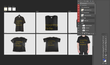
How to make an animated drawing text effect with CSS and the animate tag

How to make an animated drawing text effect with CSS and the

<animate>
<animate> tag using only CSS with no javascript.

View a working example on GitHub.

Plain text
Copy to clipboard
Open code in new window
EnlighterJS 3 Syntax Highlighter
<!DOCTYPE html>
<html lang="en">
<head>
<meta charset="UTF-8" />
<meta name="viewport" content="width=device-width, initial-scale=1.0" />
<meta http-equiv="X-UA-Compatible" content="ie=edge" />
<link rel="stylesheet" href="style.css" />
<title>Static Template</title>
</head>
<body>
<div class="container">
<svg width="600" height="250" class="text">
<defs>
<linearGradient id="geekColor" gradientTransform="rotate(90)">
<stop offset="0%" stop-color="#91bd3a">
<animate
attributeName="stop-color"
values="#91bd3a;#12cad6;#91bd3a"
dur="10s"
begin="3s"
repeatCount="indefinite"
></animate>
</stop>
<stop offset="100%" stop-color="#12cad6">
<animate
attributeName="stop-color"
values="#12cad6;#91bd3a;#12cad6"
dur="10s"
begin="3s"
repeatCount="indefinite"
></animate>
</stop>
</linearGradient>
</defs>
<text class="logo_text" x="0" y="100">
A Painting For The Emperor
</text>
</svg>
</div>
</body>
</html>
<!DOCTYPE html> <html lang="en"> <head> <meta charset="UTF-8" /> <meta name="viewport" content="width=device-width, initial-scale=1.0" /> <meta http-equiv="X-UA-Compatible" content="ie=edge" /> <link rel="stylesheet" href="style.css" /> <title>Static Template</title> </head> <body> <div class="container"> <svg width="600" height="250" class="text"> <defs> <linearGradient id="geekColor" gradientTransform="rotate(90)"> <stop offset="0%" stop-color="#91bd3a"> <animate attributeName="stop-color" values="#91bd3a;#12cad6;#91bd3a" dur="10s" begin="3s" repeatCount="indefinite" ></animate> </stop> <stop offset="100%" stop-color="#12cad6"> <animate attributeName="stop-color" values="#12cad6;#91bd3a;#12cad6" dur="10s" begin="3s" repeatCount="indefinite" ></animate> </stop> </linearGradient> </defs> <text class="logo_text" x="0" y="100"> A Painting For The Emperor </text> </svg> </div> </body> </html>
<!DOCTYPE html>
<html lang="en">
  <head>
    <meta charset="UTF-8" />
    <meta name="viewport" content="width=device-width, initial-scale=1.0" />
    <meta http-equiv="X-UA-Compatible" content="ie=edge" />
    <link rel="stylesheet" href="style.css" />
    <title>Static Template</title>
  </head>
  <body>
    <div class="container">
      <svg width="600" height="250" class="text">
        <defs>
          <linearGradient id="geekColor" gradientTransform="rotate(90)">
            <stop offset="0%" stop-color="#91bd3a">
              <animate
                attributeName="stop-color"
                values="#91bd3a;#12cad6;#91bd3a"
                dur="10s"
                begin="3s"
                repeatCount="indefinite"
              ></animate>
            </stop>

            <stop offset="100%" stop-color="#12cad6">
              <animate
                attributeName="stop-color"
                values="#12cad6;#91bd3a;#12cad6"
                dur="10s"
                begin="3s"
                repeatCount="indefinite"
              ></animate>
            </stop>
          </linearGradient>
        </defs>

        <text class="logo_text" x="0" y="100">
         A Painting For The Emperor
        </text>
      </svg>
    </div>
  </body>
</html>

Credits: Code MIT Licenced | Image Credits: Unsplash